Nobee: Designing a Unified Brokerage Management System
Overview
For two years, Nobee was a real estate brokerage that assisted renters in finding homes, scheduling tours, and signing leases. After seeing interest from other agents in their software, Nobee first created a deal management system. However, they soon realized it wasn't enough for agents' needs, so they decided to combine it with their internal CRM and offer an all-in-one brokerage management solution.
As the sole designer, I owned the whole design process of merging the systems.
Context
Full-time remote internship
Timeline: Sep - Dec 2023
Team
1 Designers,
1 Product Owner
4 Developers
My role
Design Lead
Feedback Gathering
Data Analyzing
GOAL
Merge the internal and deal management systems into one brokerage management solution in 3 month
PROBLEM
How might we quickly integrate two systems into one unified solution that has UI and behavioral consistency across features?
SOLUTION
Using Nobee's internal system as the primary foundation, while placing deal management features where they would create the least friction
Due to technical constraints, a restricted timeframe, and limited team capacity, we opted for a quick solution: combining both systems with the internal one serving as the main base. Our focus was on addressing bugs and ensuring the seamless integration of features.
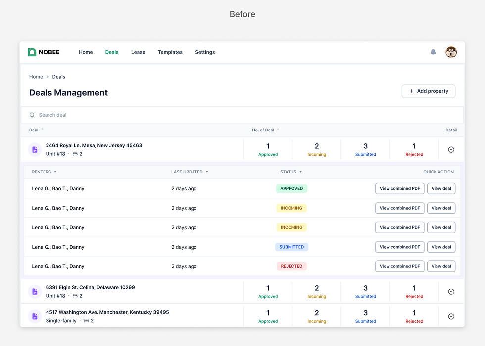
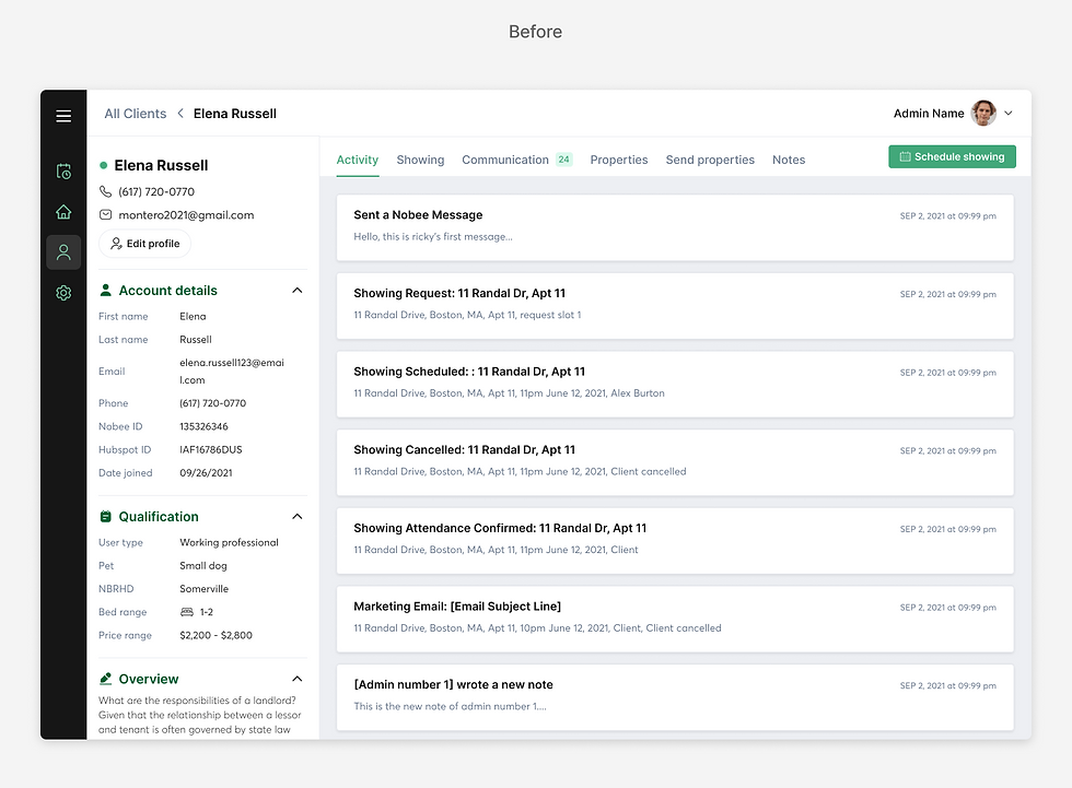
From two separate systems...

...to one unified solution.

IMPACT
Successfully delivered the design in time and led 2 iterations post-launch, achieving a 50% reduction in property listing time for agents
While the timeline was tight, I managed to gather feedback and analyze user analytics to make informed design decisions within the team, as well as improve the design system to be more consistent and accessible.
So, how did we get here?
1. NAVIGATION
Optimized the Information Architecture and Nav Bar: enhance findability and maximize screen space


2. DESIGN SYSTEM
Updated the Design System to improve consistency and accessibility
Color, typography, and accessibility tags
The original brand green had low contrast with both white and black. I focused on improving the color contrast for all elements, while also updating the typography to one typeface for consistency. Finally, I worked alongside developers to add tags to critical elements as time allowed.

In-page navigation
I decided to go with a horizontal in-page navigation instead of vertical to maximize the layout space.

Table
I optimized the table interaction by replacing unnecessary fields with more intuitive action interactions (e.g. "View details" changed to simply selecting the respective row). This redesign focused on maintaining consistency across table components while avoiding big modification.


3. QUICK FIXES
Redesigned pages to ensure UI and interaction consistency across features
Lease Template


All Deals


Deals
Added buttons to link deals management system with other features.


Clients
Pages originally from the internal system, such as Clients, only had few changes to save effort as much as possible.


POST-LAUNCH ITERATIONS
Boosted agents' efficiency with property listing setup by simplifying the form and providing a checklist
After the launch, I gathered feedback and analytics from some of our first users, as well as contacted Nobee's previous agents to ask about their experience using the internal software. The team learned uncovered critical insights about the Listing Management page:
Incompleted listing
Users took a long time to finish
a listing, and could leave it incomplete for days.
Confusing
Users sometimes got confused because the listing couldn't go active and they didn't know why.
All this boils down to...
The process of setting up a propety listing was too complicated.
"It was a lot to gather all the required information, and some are not even necessary! [...] Also, it never told me which field I was missing."


New checklist empowers agents: By clearly outlining required fields, they can complete property listing activation in under 3 days. This is a significant improvement from the past 5-day process, which often stalled due to scattered information and unclear activation requirements.
KEY LEARNINGS
Startups move fast
Get designs out fast while ensuring quality, and be agile
My first experience in a preseed startup was a hustle, but it taught me how to get things done fast. While my process and timeline were shorter than usual, I did extensive research and competitor analysis to ensure the quality of my final design. Being in an Agile environment also taught me that it is not always good to be pixel-perfect, as I will eventually iterate and refine my design.
Listen to users more
Unfortunately, my internship concluded shortly after the product launch, limiting my opportunity to delve deeper into user feedback for the entire platform. If given more time, my plan was to conduct a more thorough analysis of user analytics and gather valuable insights for subsequent iterations. However, I'm glad that despite having limited time, I successfully convinced my team to consider user analytics and engage with our previous agents, contributing to more informed decision-making.
THANK YOU FOR MAKING THIS FAR DOWN!
Still interested? Check out more of my work!
INTERNSHIP / LAUNCHED

